The base idea and case study process for Belek Homes and a mood board of clients' ideas and creation based on briefing and revisions are displayed next.
The following pictures explain, in short, the process of the brand Belek Homes. The steps I took led to the final result found on the previous page.
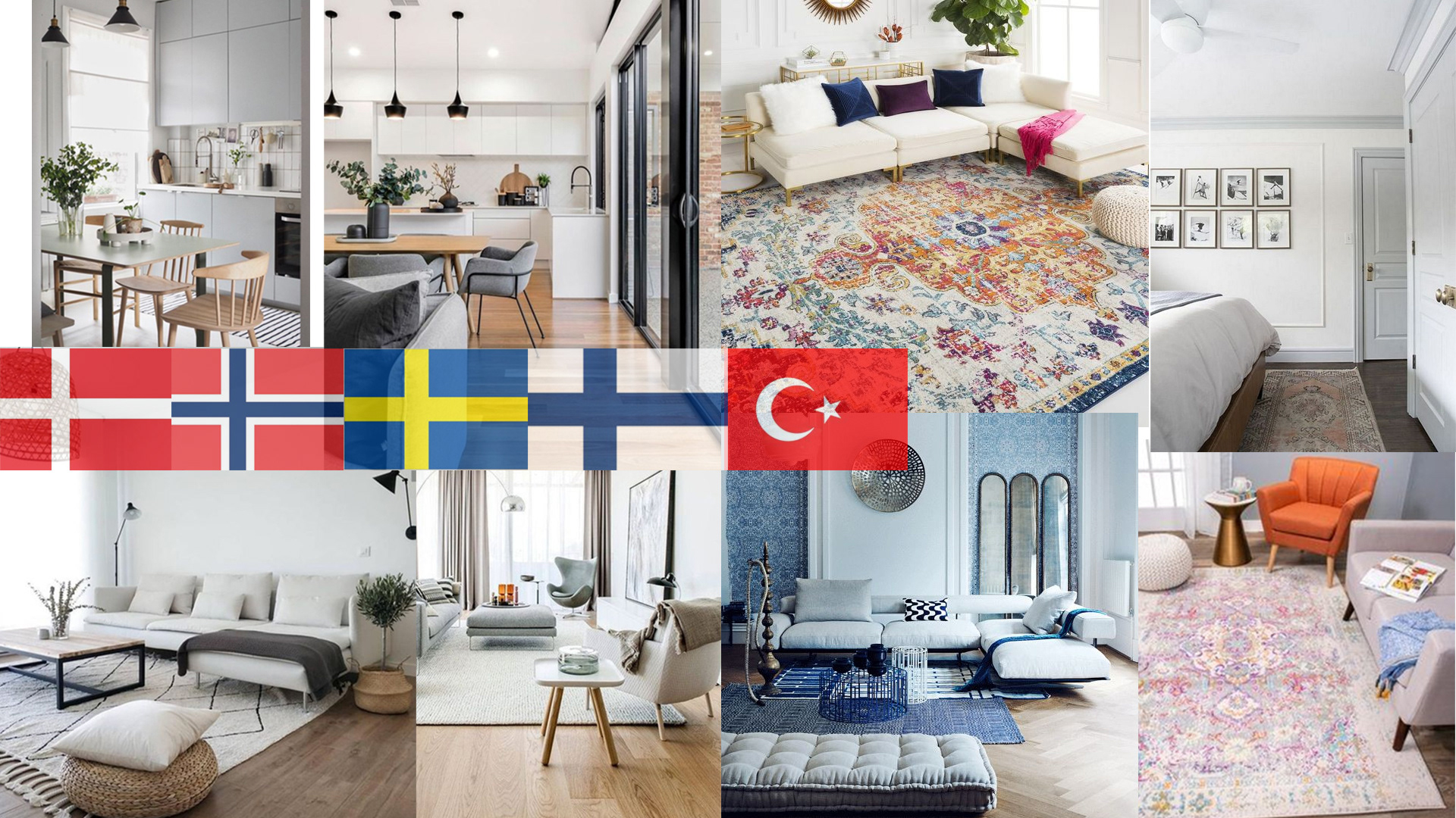
The idea was to bring Nordic luxury to the Turkish market without breaking traditional style too much. Pictures taken of locations were supposed to give the Turkish style.
Belek Homes did colours, fonts, and the logo with neutral colours represented by the Nordic style. The use of a light sandy beige and granite grey becomes the brand's primary colours.

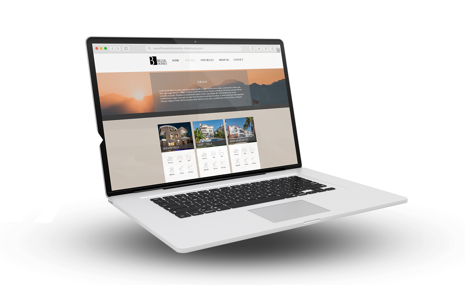
We are changing the old saturated and none consistent to a modern, stylish luxury look.
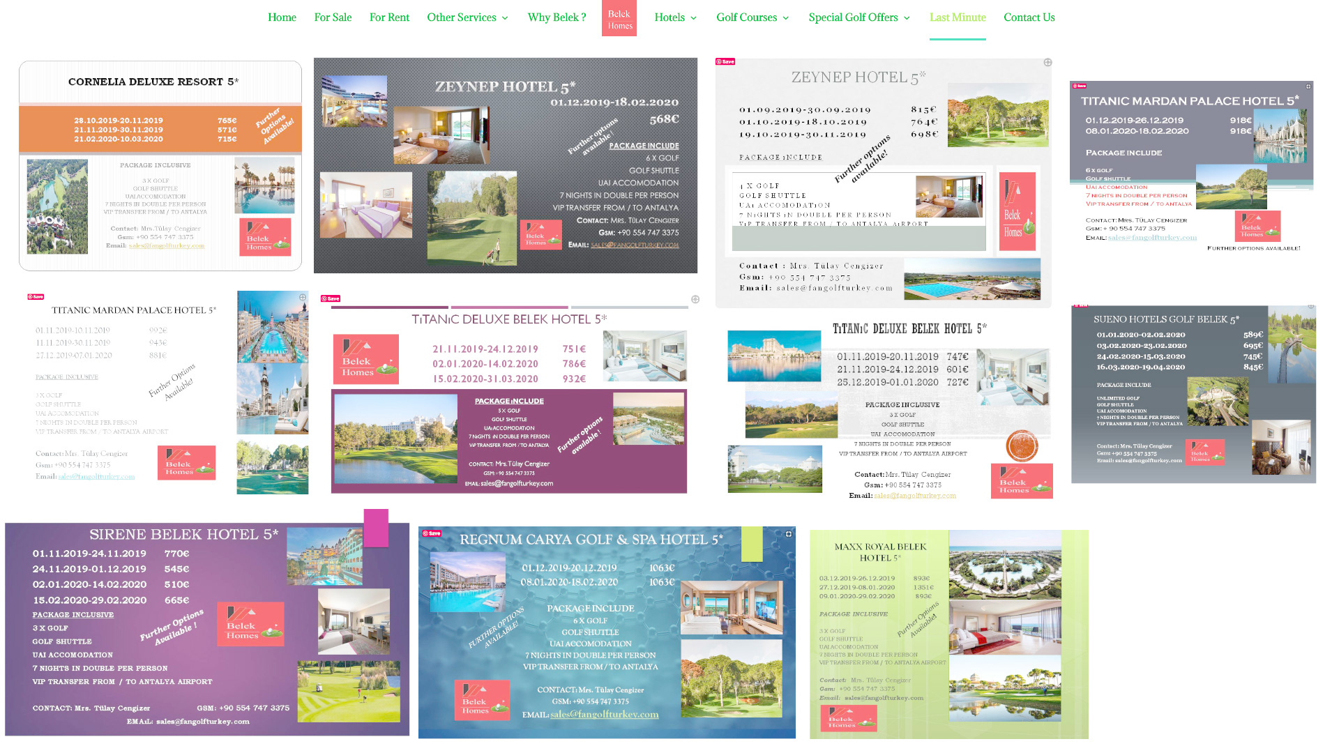
Old heavy and screeming site.