The website wireframe for Belek Homes was made with Figma. Keeping the 60, 30, 10% rule in mind on the mobile site using base white as the main colour, beige as primary, and granite grey as a secondary colour. Lastly, the footer is always dark granite, and I also used this for the dark fonts and the google map.
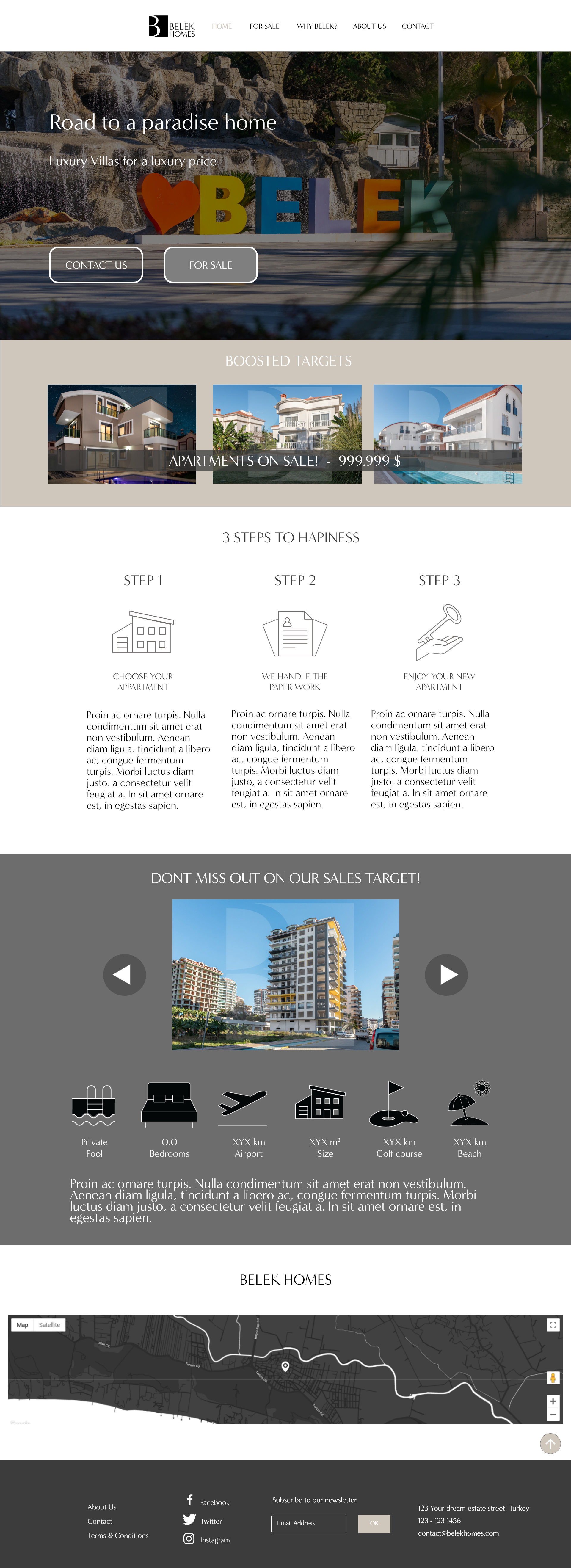
Landing Site
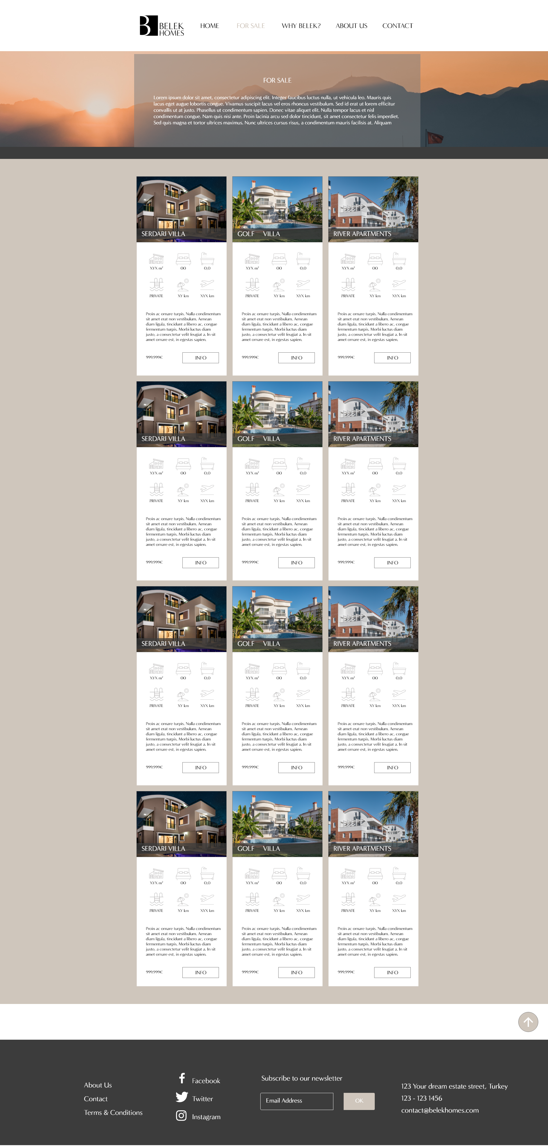
Sales
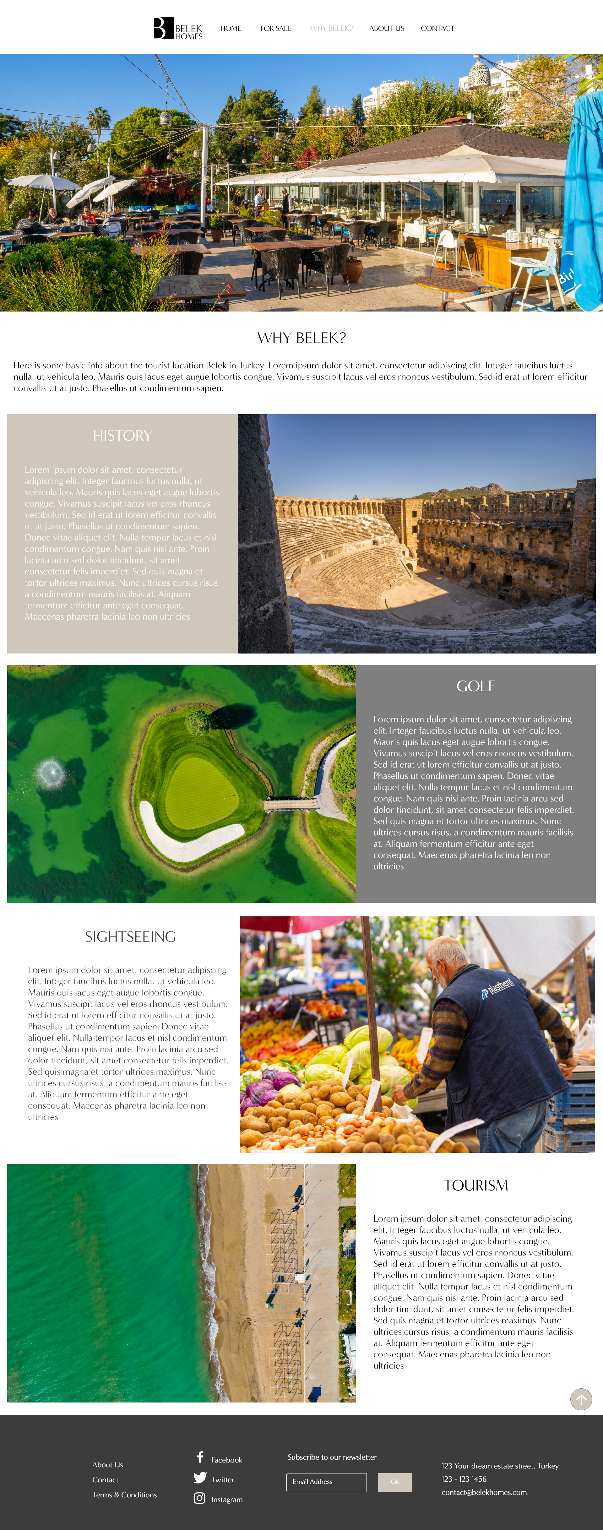
Belek info site

Contacts etc.
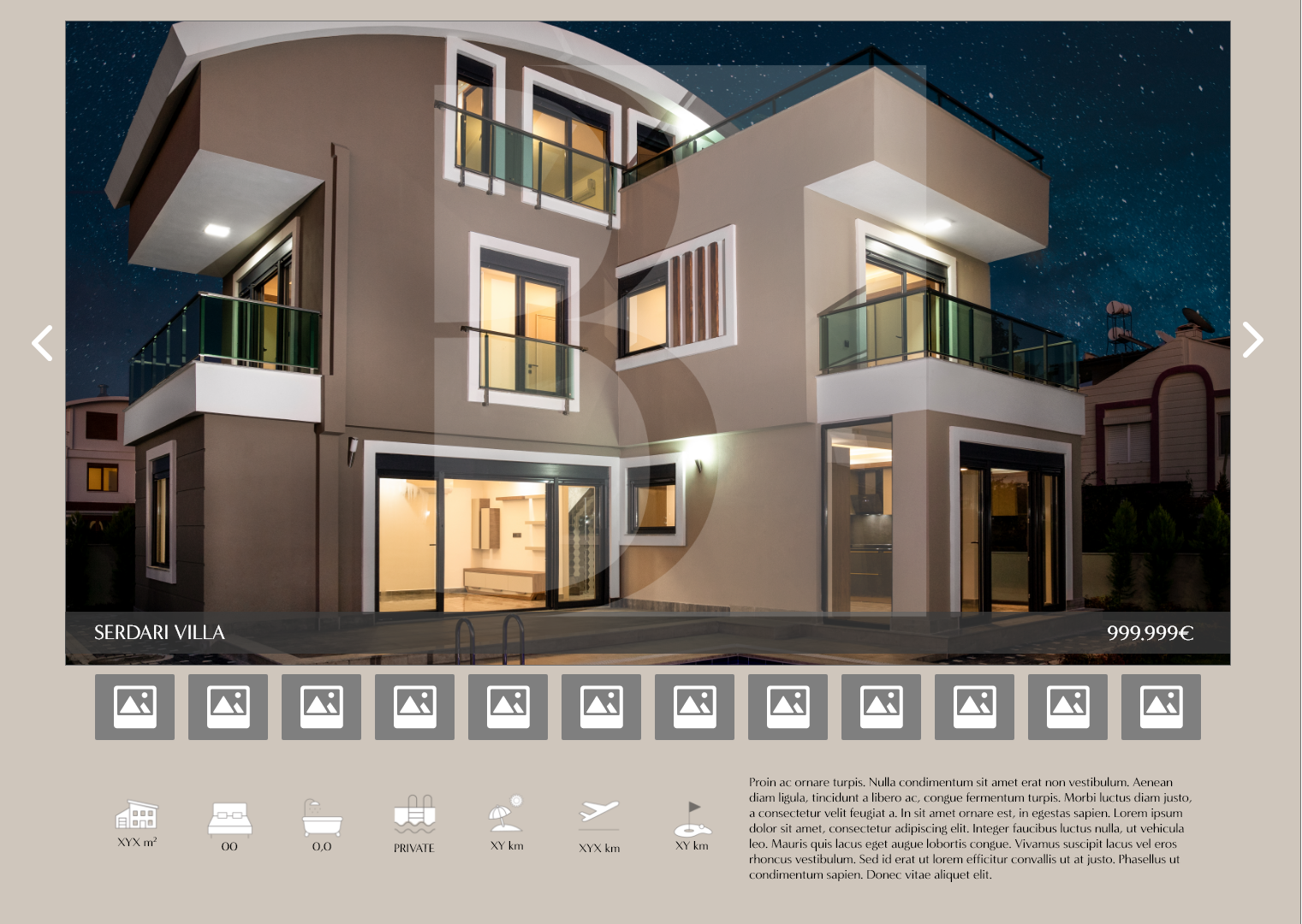
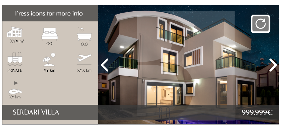
Lightbox aka Pop up for location/Product
Here you can get a basic idea of managing the content from a website I build to fit a mobile wireframe. But still, this is the webpage wireframe as a responsive result for both mobile and web.
The Mobile version of the site is displayed more concisely to keep a light feel for the site.
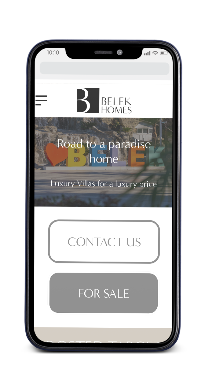
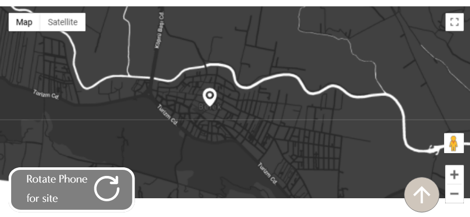
Making the mobile version of the site keeping it light but still, concize was a challenge but using the screens option of being horizontal, I made sure to show the products and location clearly.
Keeping the product popup page simple with relevant information as custom Icons that lead to slide pop up with more text kept the UI more simple and easy read.