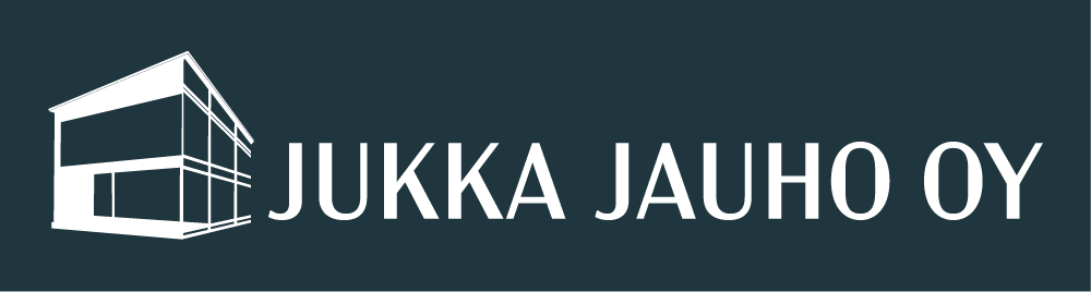
I created this design for a contractor who wanted a clear yet modern brand look, with some masculinity in it and relating to Finnish nature. The buildings made by this client are stylish and eco-friendly and were part of the design.
Since the logo was used for truck sides, I made a more extended version with the base logo on the left-hand side and the name on the right-hand side.
The use of dark green, white and black gave enough colour options depending on the situation.
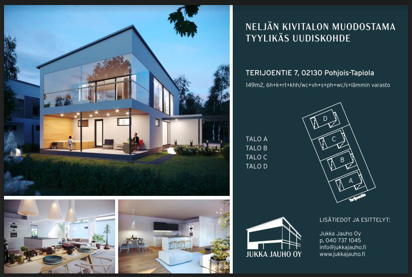
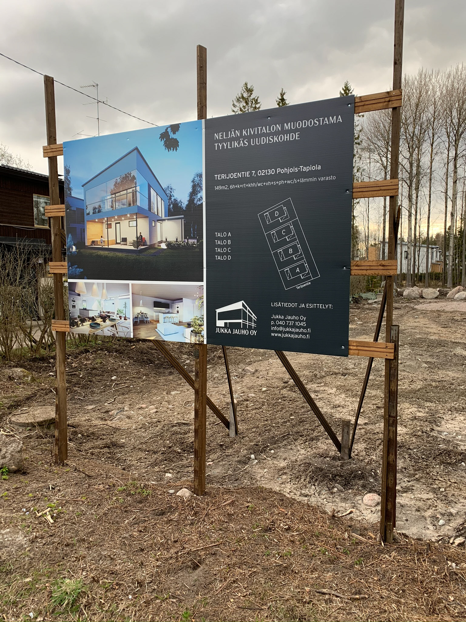
Jukka Jauho road sign for upcoming construction, vector layout
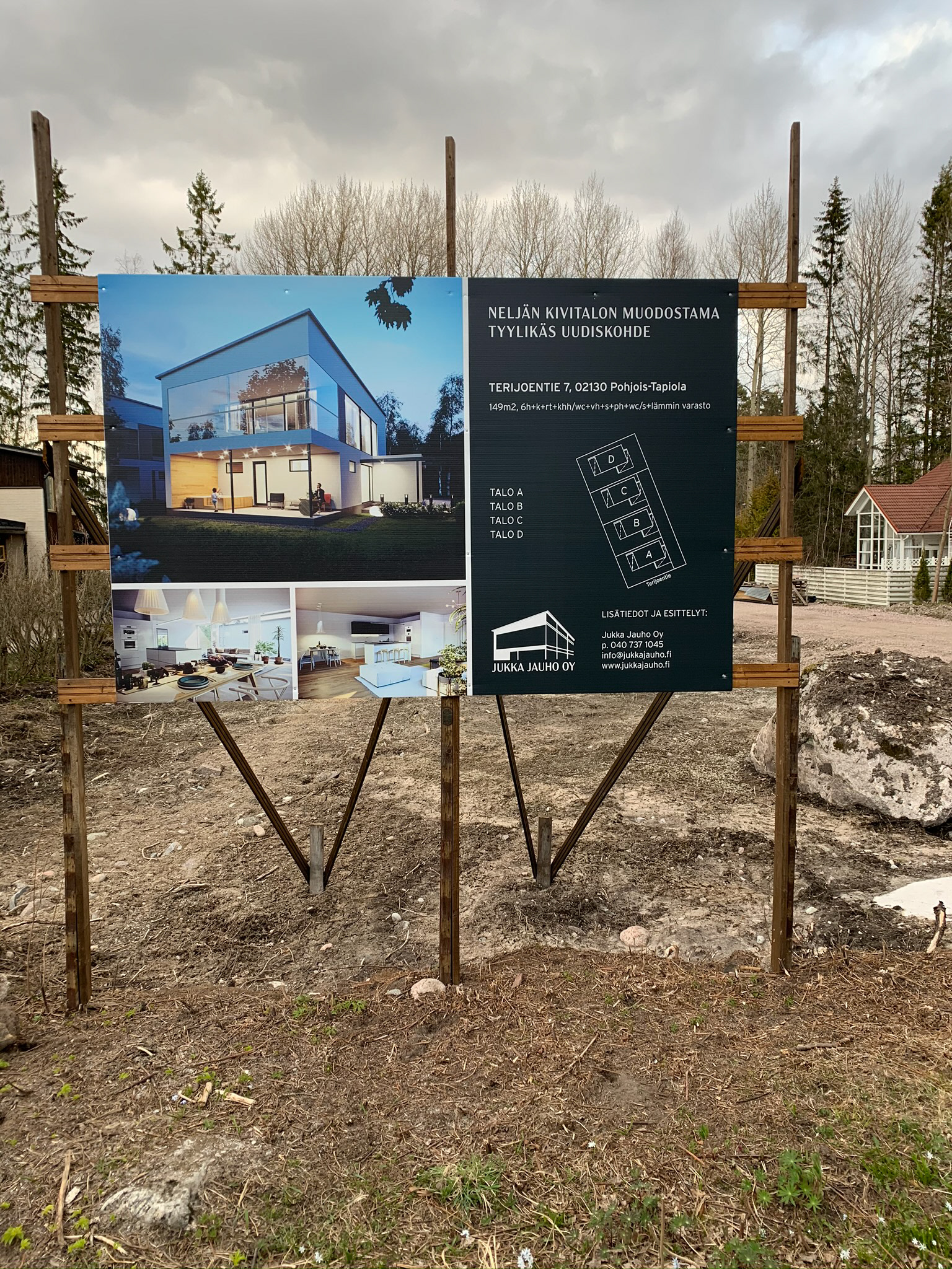
Terijoki worksite and sign for the future upcoming project
The Actual product 3
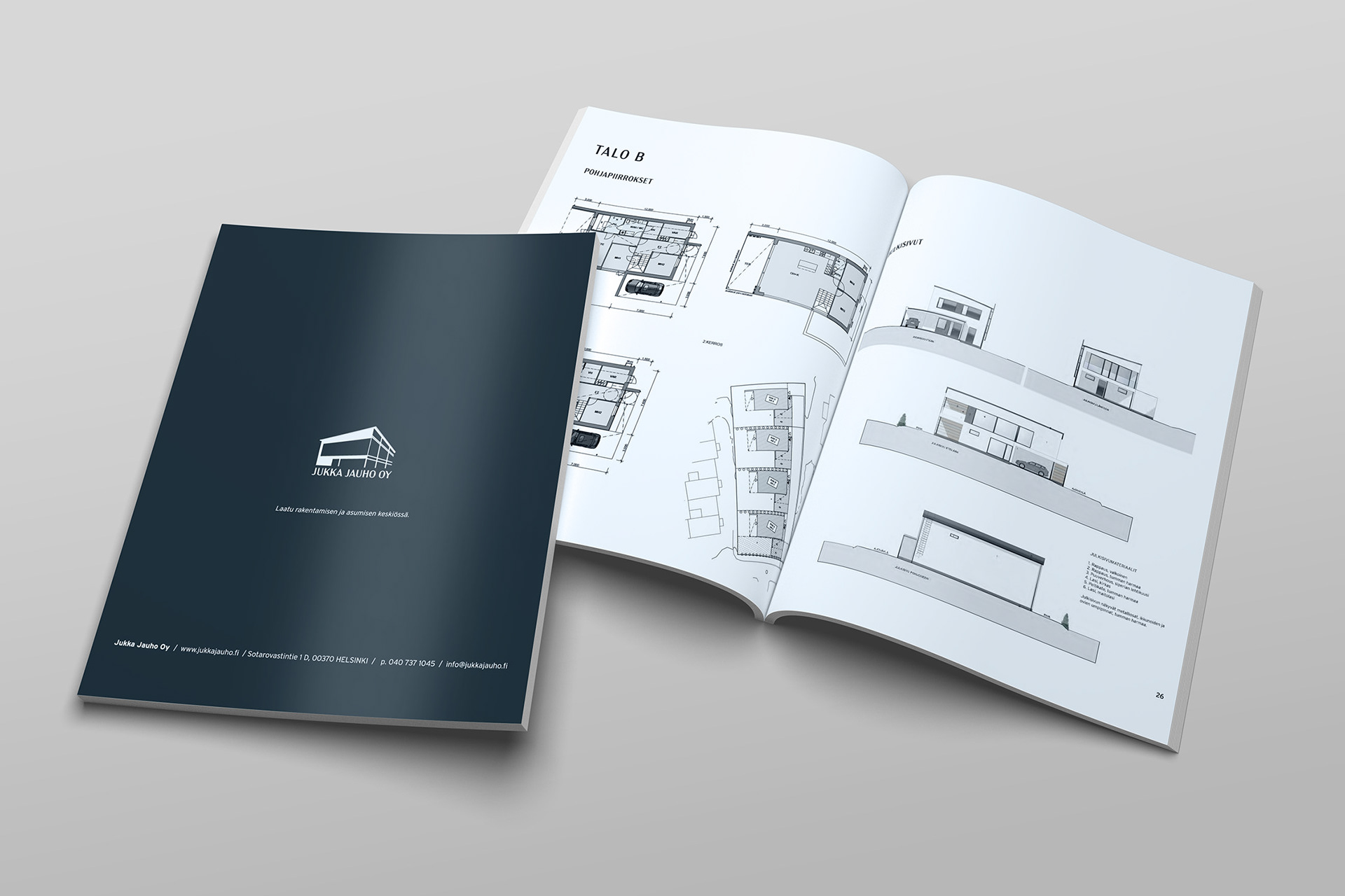
Real estate catalogue for object. Terijoki
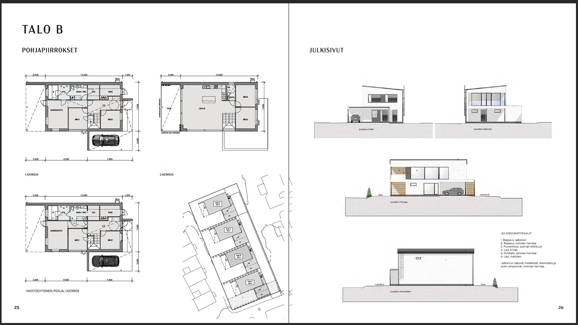
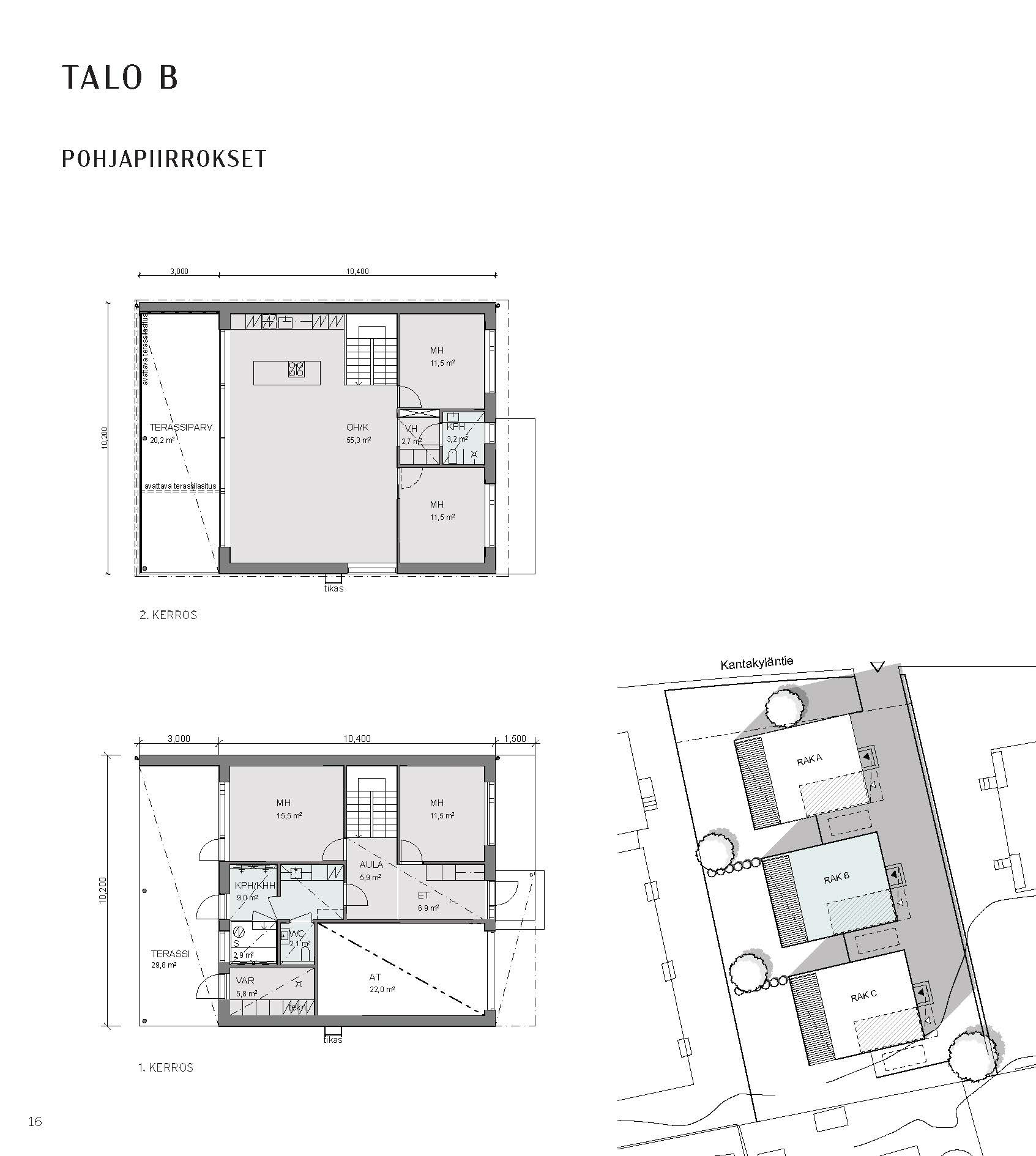
Here are example pages of the product brochure for Terijoki, with a map and top-down view of apartments, made to follow the brand.
I took the liberty to make a graphical image from the blueprints, making them simplified and following the theme.
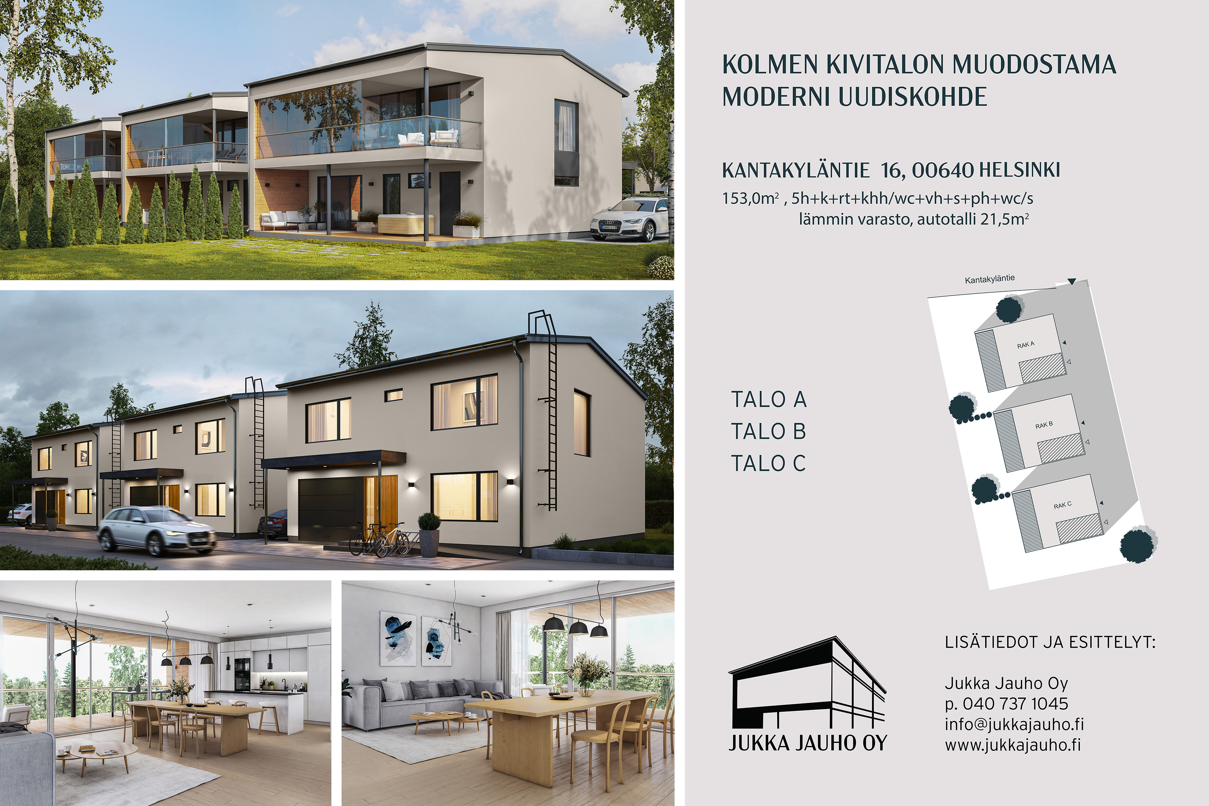
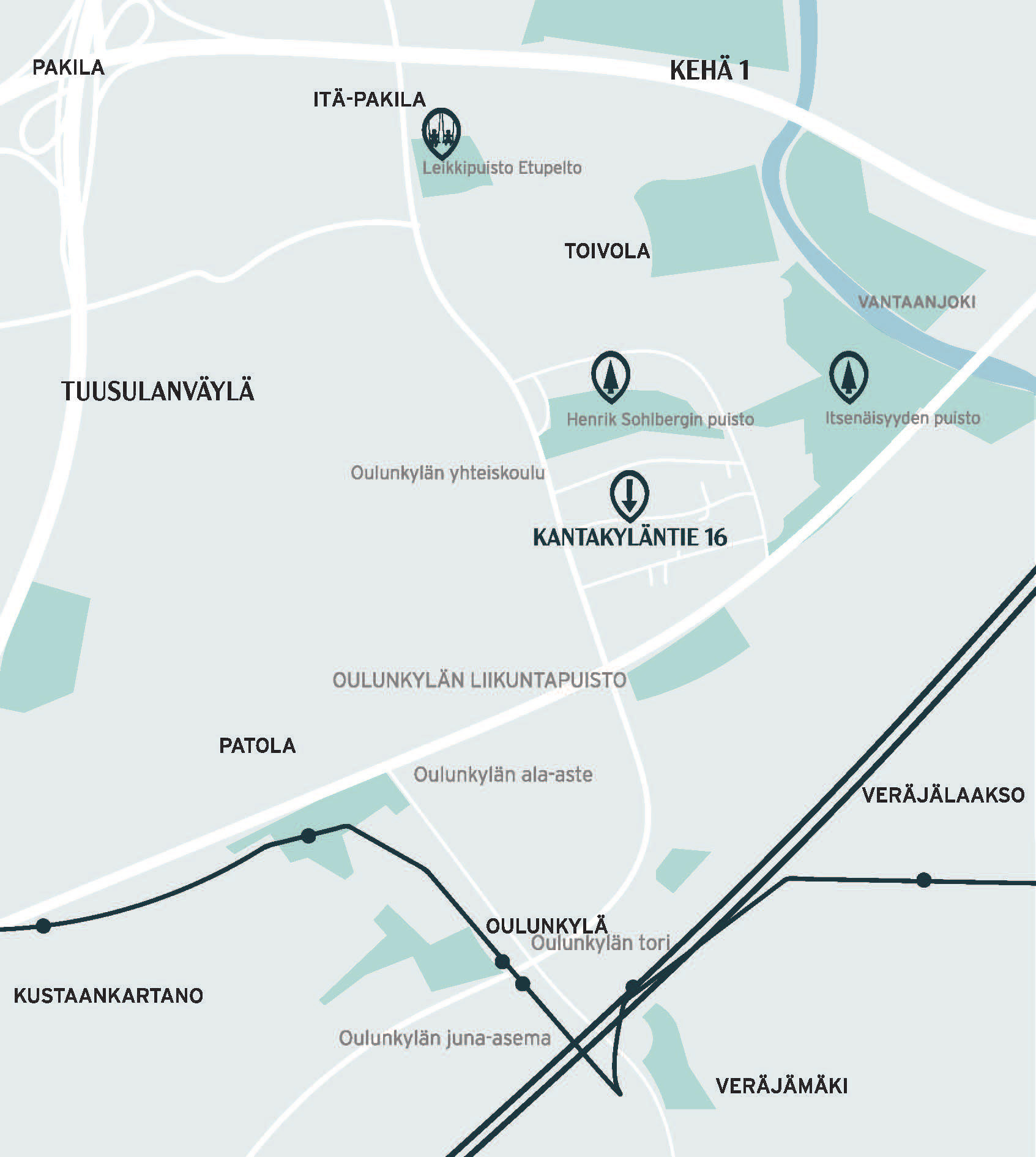
Kantakyläntie is a second worksite and project for Jukka Jauho, made in the same theme but still differs from the other site. I am still keeping the same colours and easily understandable design.
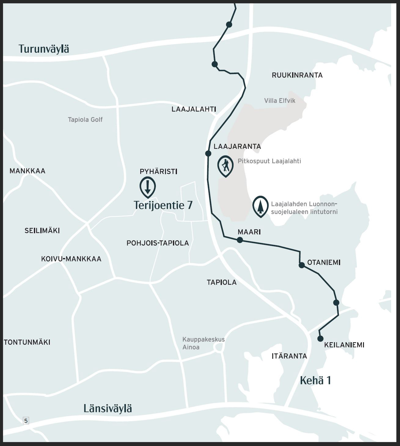
A simple map was made with the help of google maps satellite images for future customers to find the object. I made the map a simple version with the theme's colours and fonts.
I added some custom-made icons to top it off.
Real estate catalogue for object. Kantalkylän tie


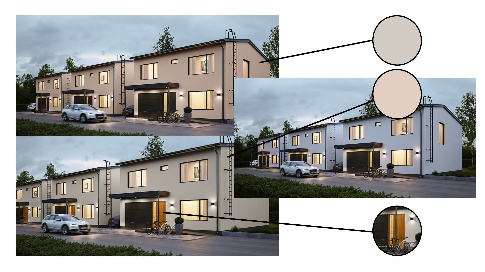
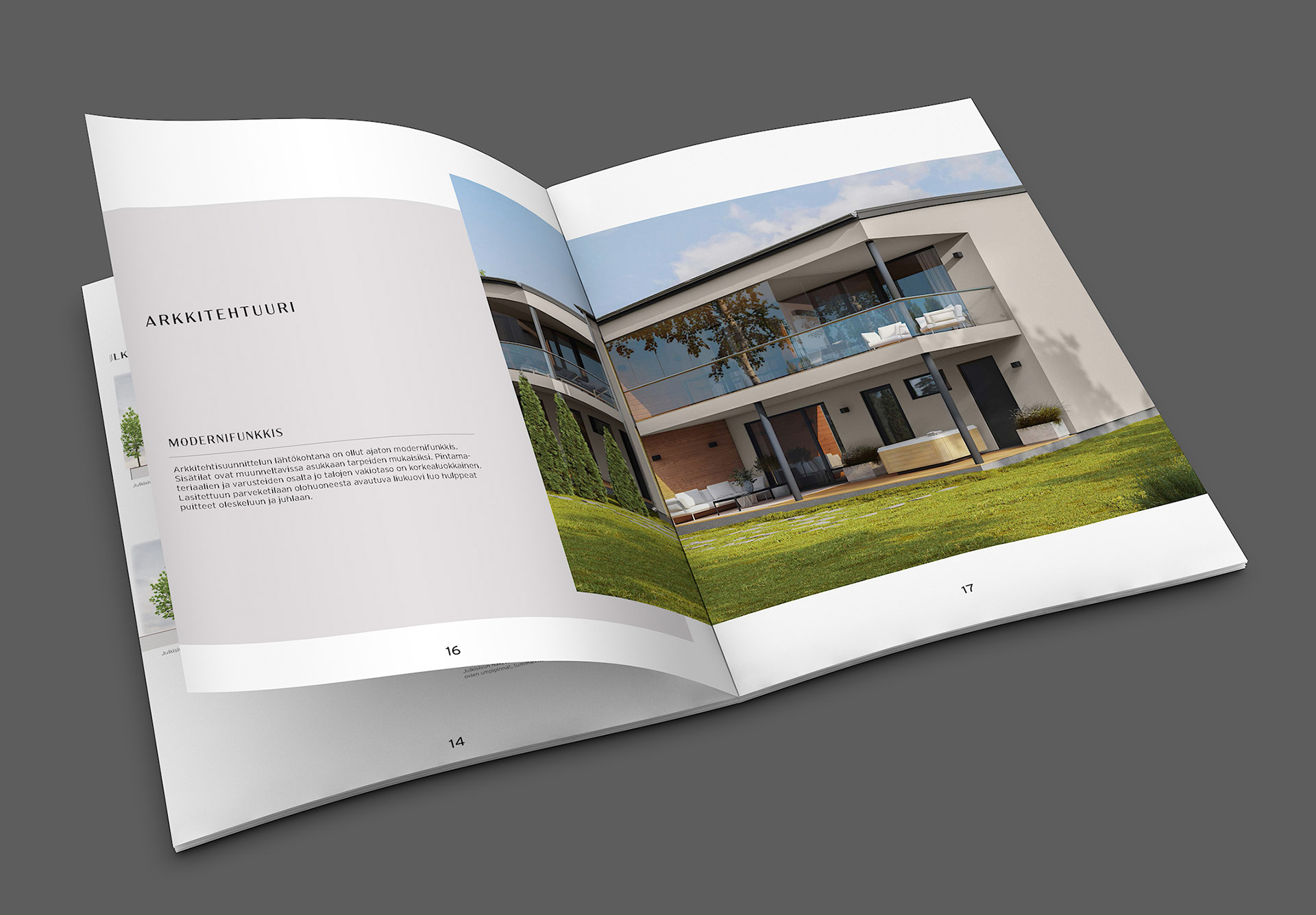
I made minor adjustments to a rendered picture using photoshop.
Changing colours on the material of the walls from white paint to different shades of beige/natural white depending on clients' needs giving more examples, opened up ideas for everyone in the project.
I also change materials on a micro-level such as the example of door models.