Not SO Toxic is an Energy drink brand strictly meant for E-sport enthusiasts who like that extra energy but still want to keep it healthy.
(This product will not be on the retail market)
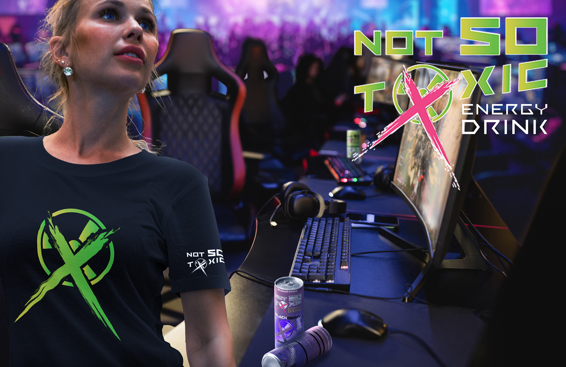
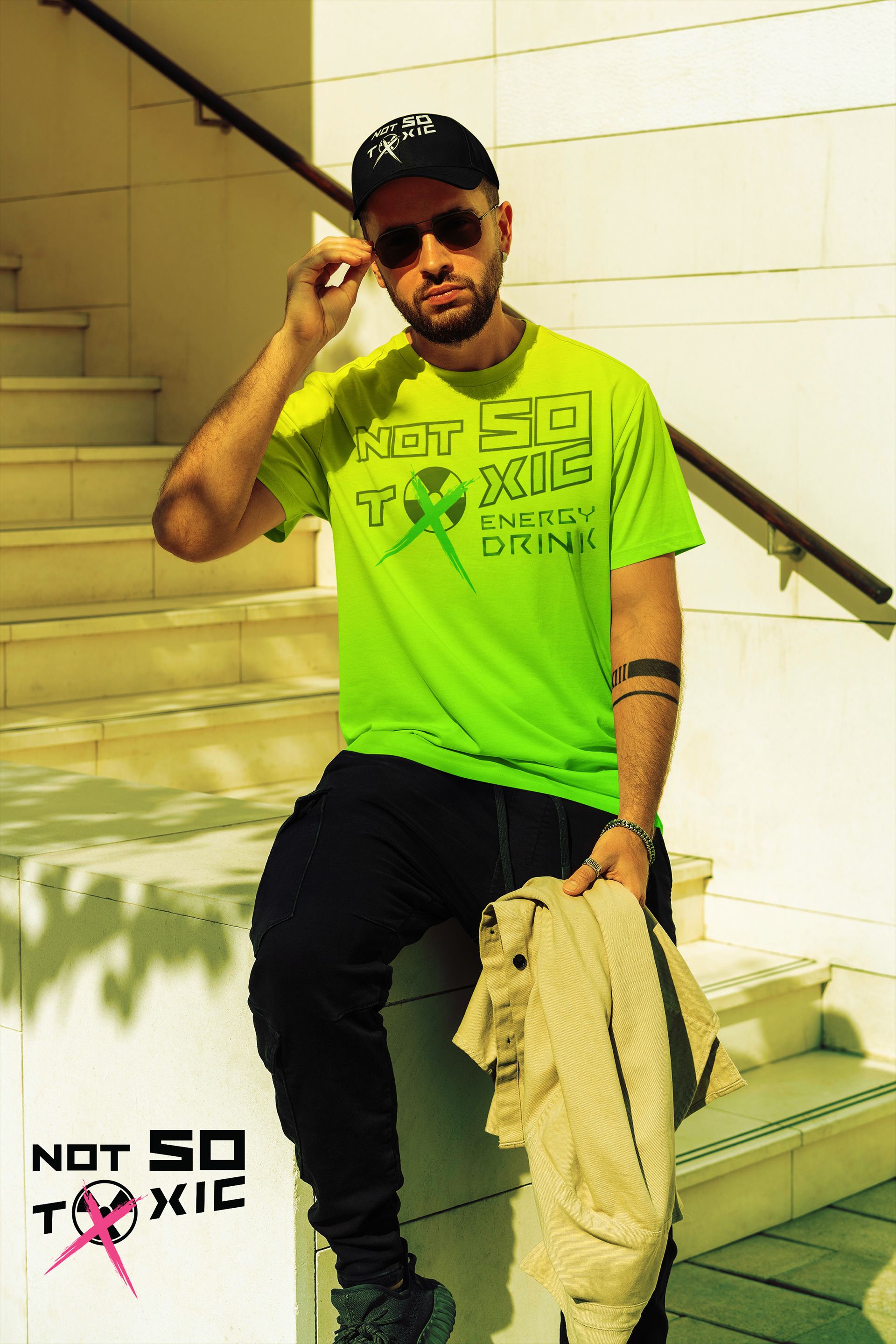
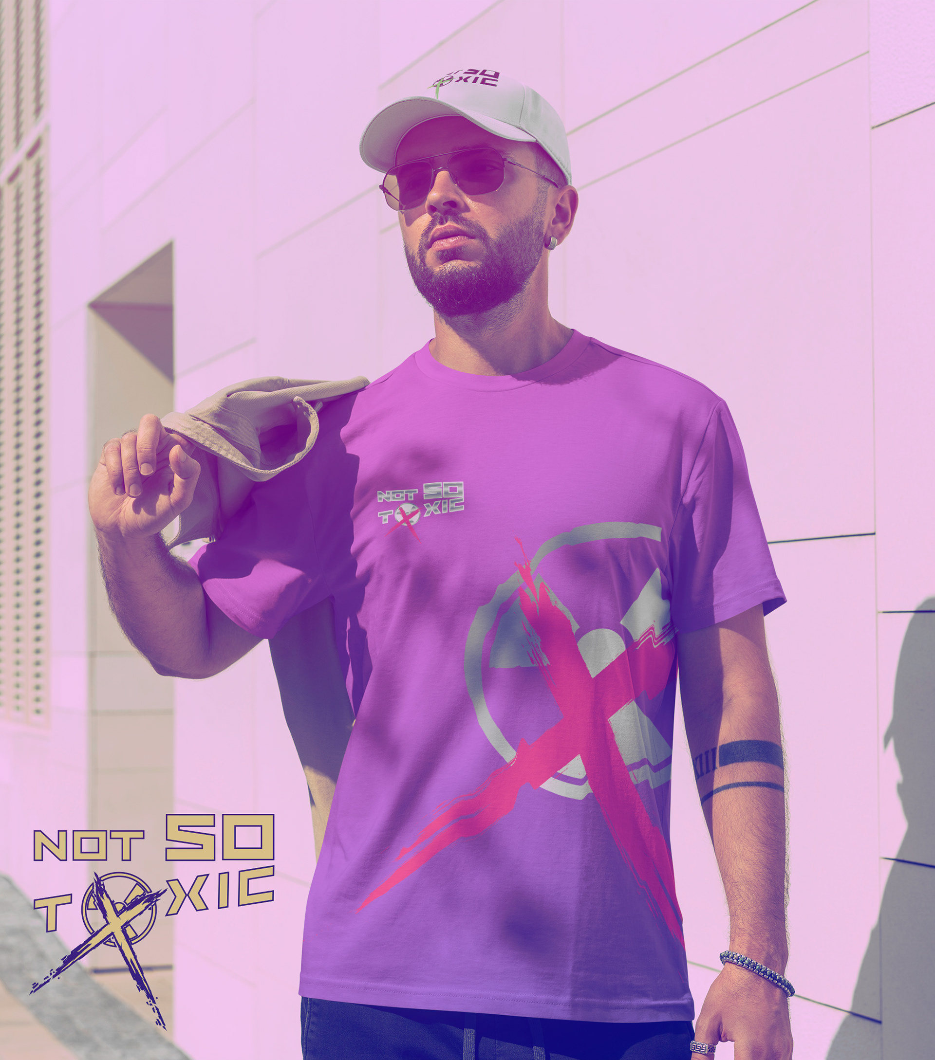
Marketing material both T-shirts and Caps where made.

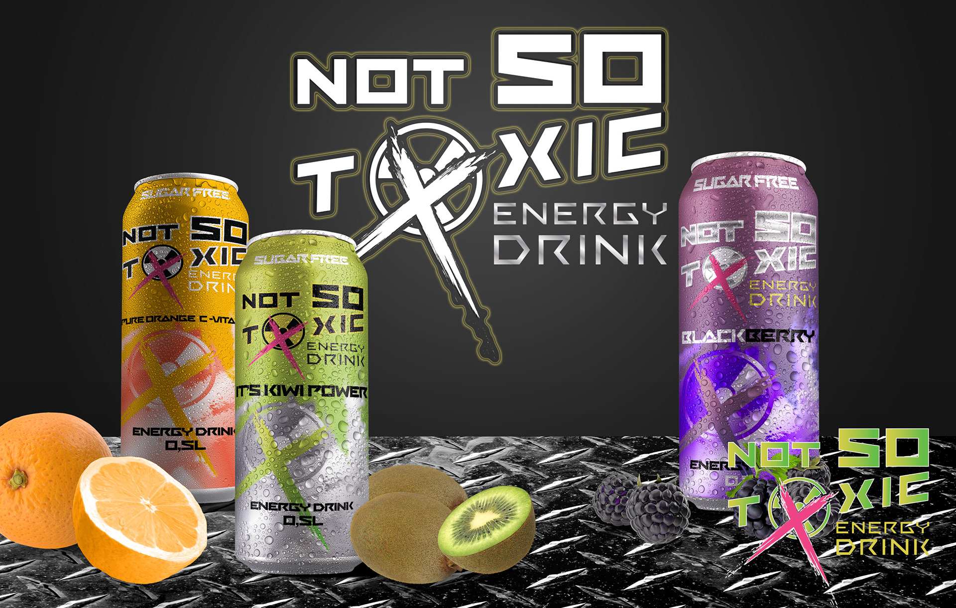
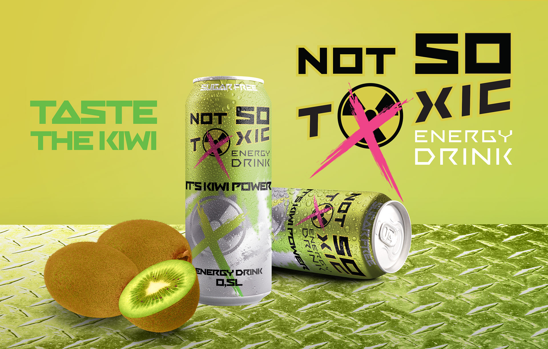
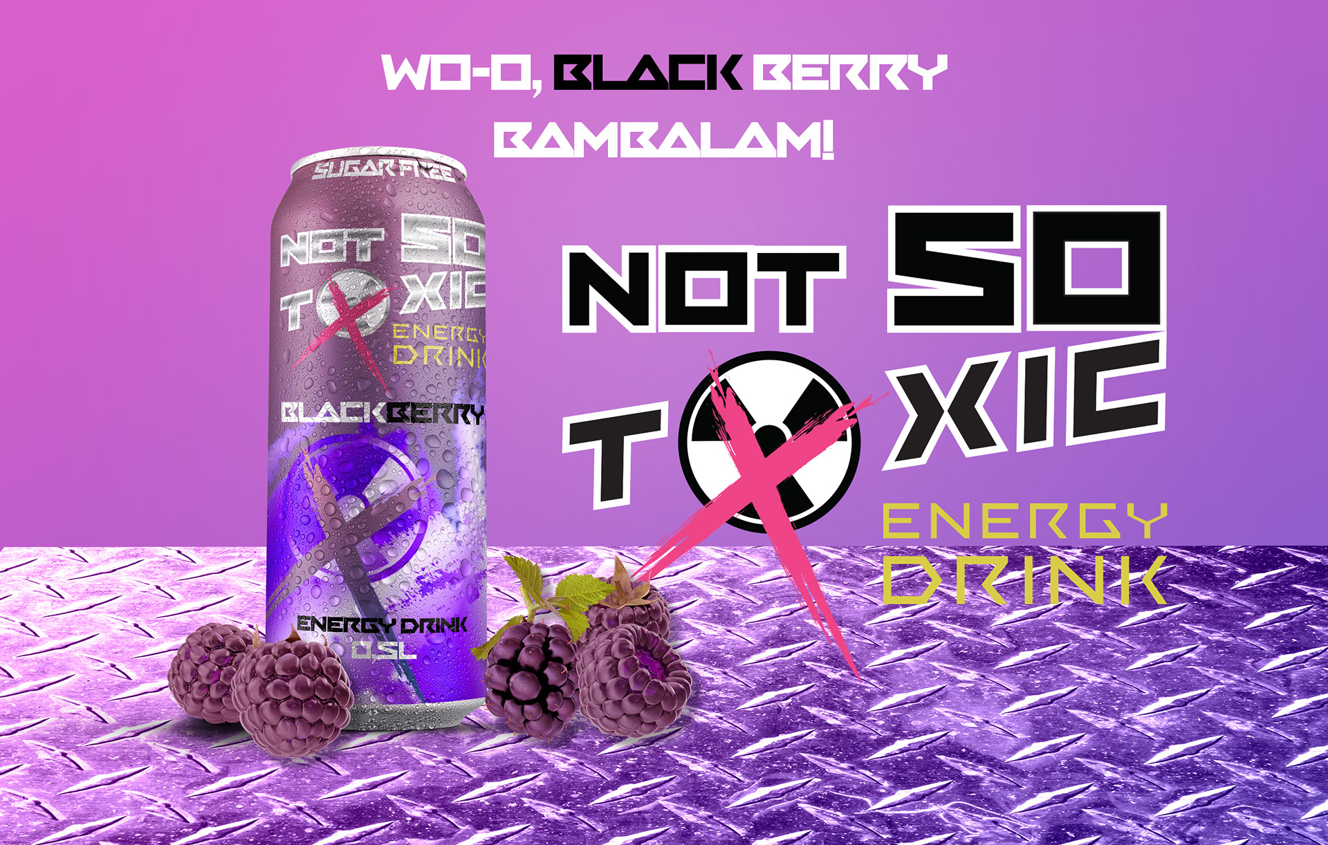
Here are the three first "Not SO Toxic" Energy drinks going to the market: our green bitter-sweet kiwi, the tasty fruity Blackberry, and lastly, the sour Orange.
The first product reveal video is made with satire in mind. Get that explosive energy of healthiness in the form of an energy drink with no sugar!
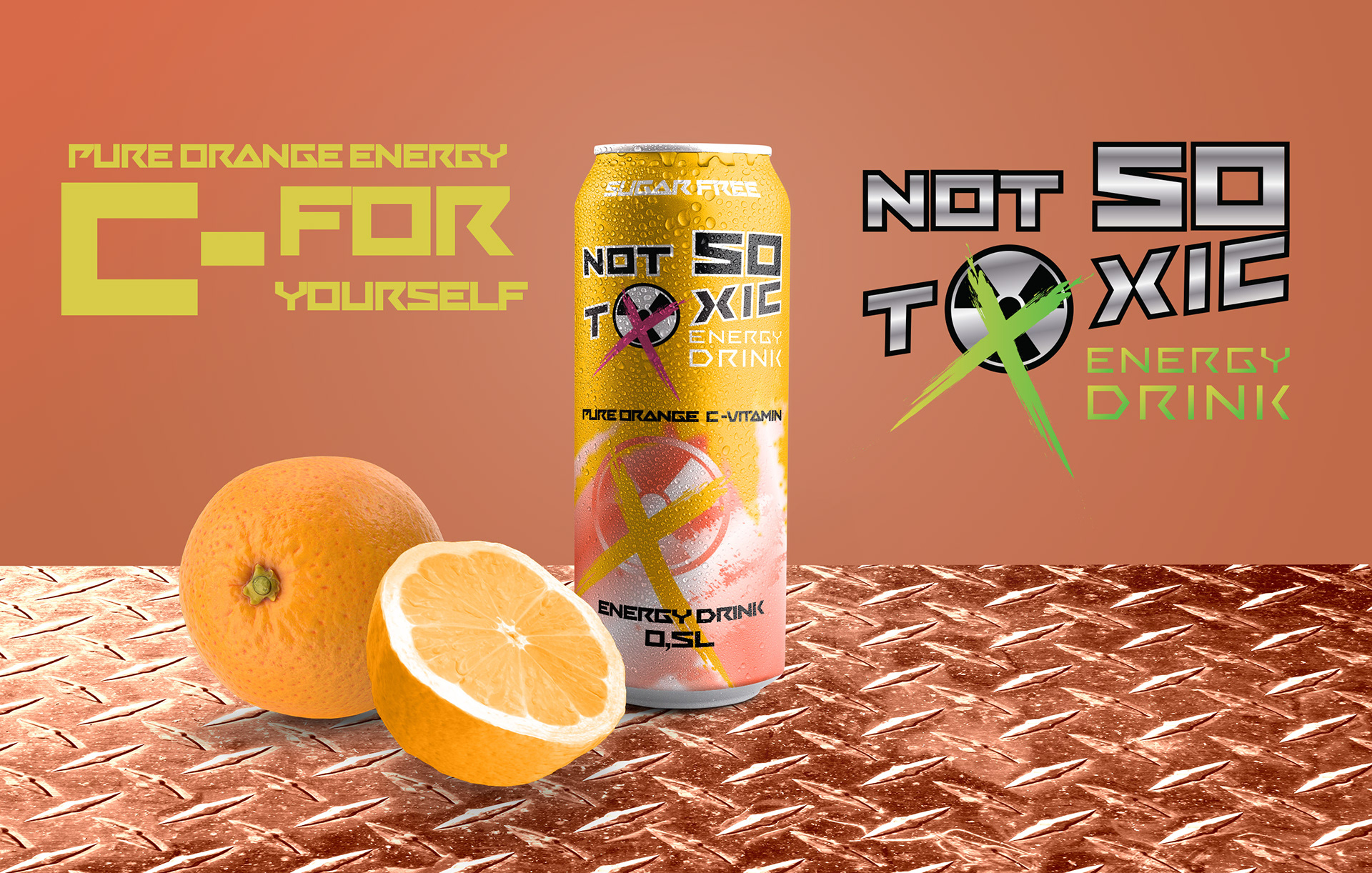
Next up is a summer campaign for our favourite Orange taste! Get that C-VITAMIN!
(For this video, I decided to use the background as part of the day. The intro is in the Morning, the Product reveal is during the day, and the Outro is in the evening.)
BlackBerry was also the new smaller can(that had not been produced yet, so I rendered a 3D can for the last ad video).
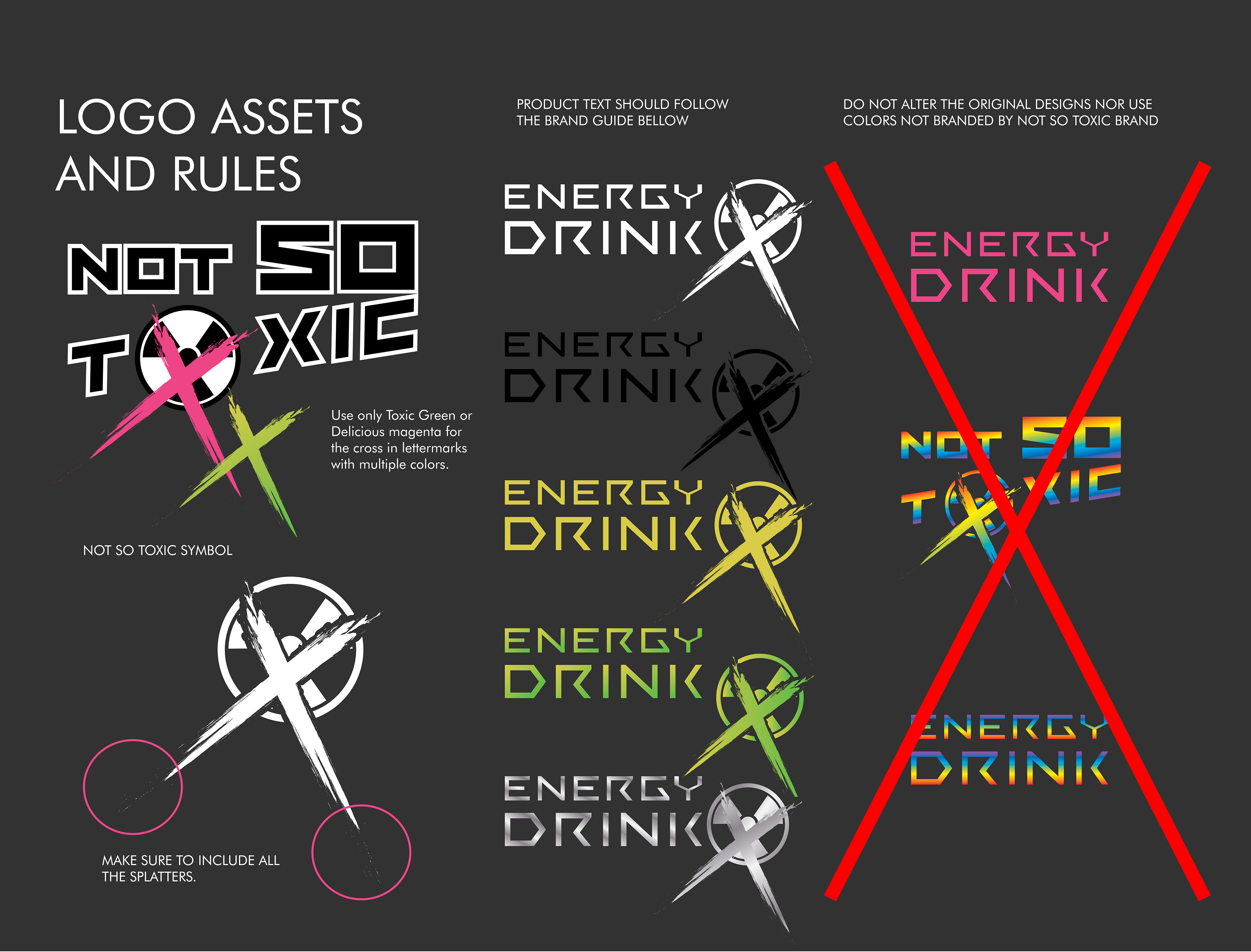
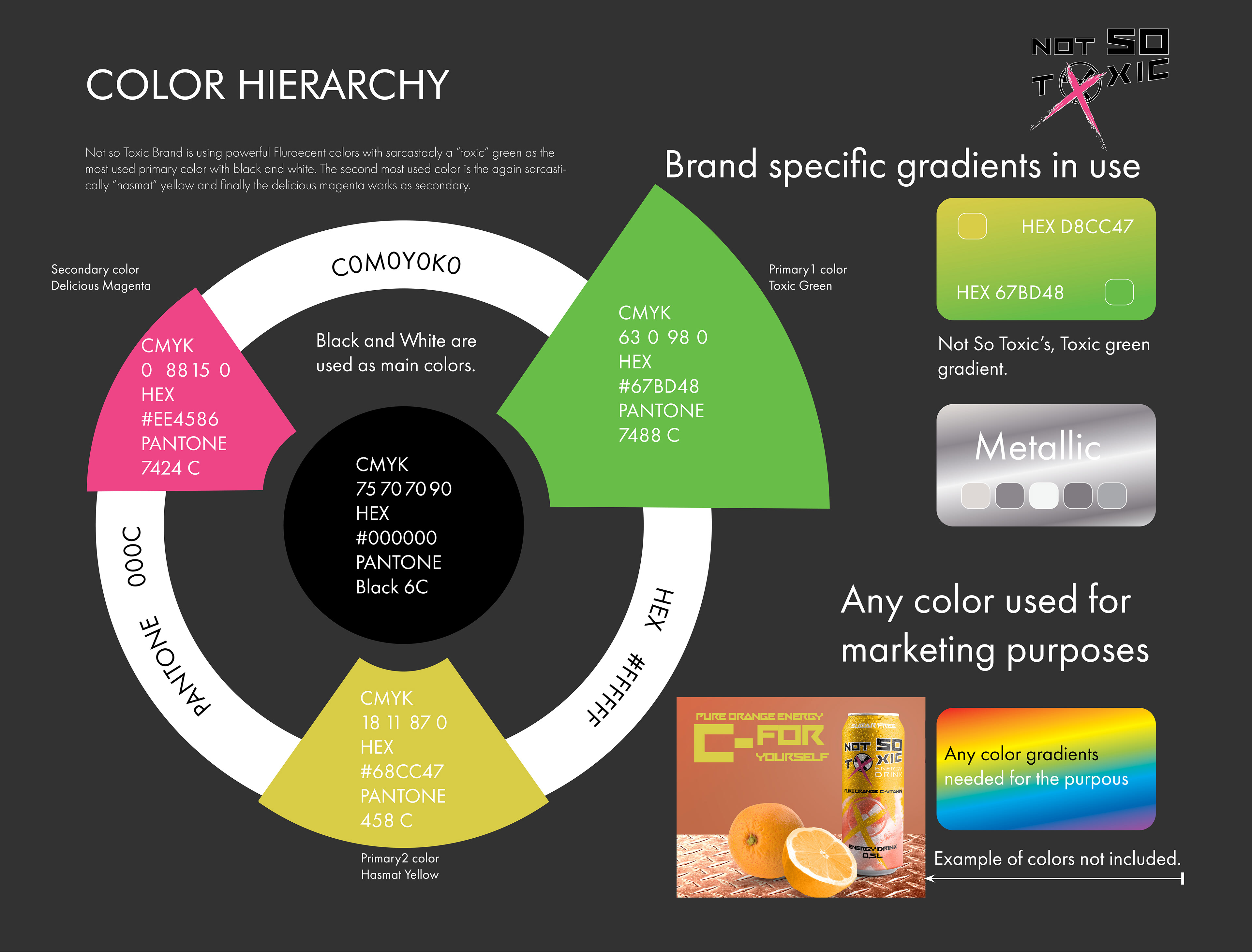
Please ensure to note the following information:
The fundamentals of branding "Not So Toxic" and specific guidelines from the branding manual (in the event of potential future occurrences) are as follows:
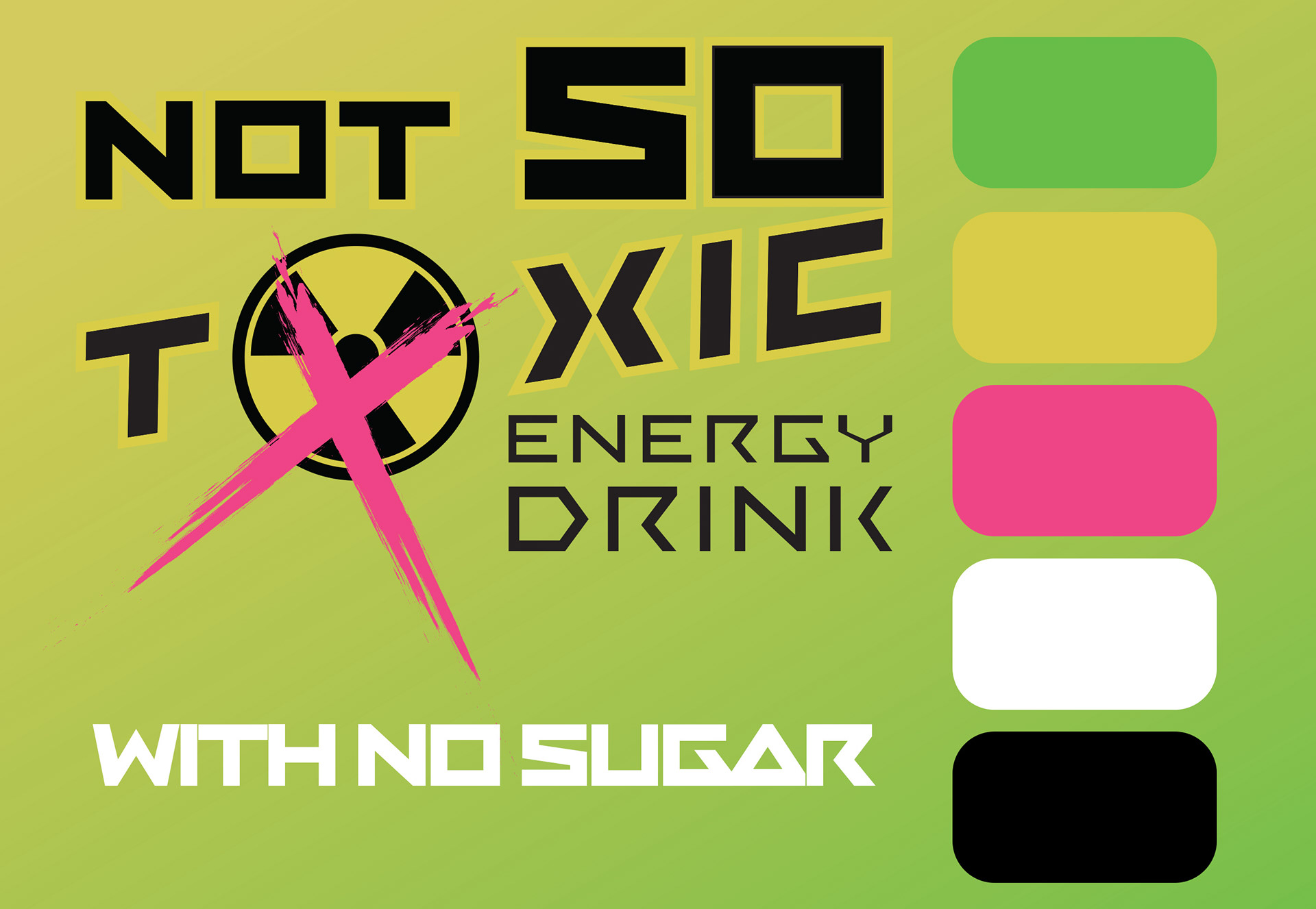
The logo utilizes the RANSOM typeface, incorporating a radioactive icon within the word "TOXIC" in place of the letter "o", which has been intentionally defaced with a crossing mark to convey a satirical meme-like impression for the brand.